
Skip to content
LEXNIS Technologies
  • Branding

A brand built around fun, freshness and youthful energy.

Client
Icy Knock
Industry
Ice cream
Services
Branding
Project
06 / 08
Icy Knock case study

01Chapter 01

A Journey of Bold & Refreshing Flavors

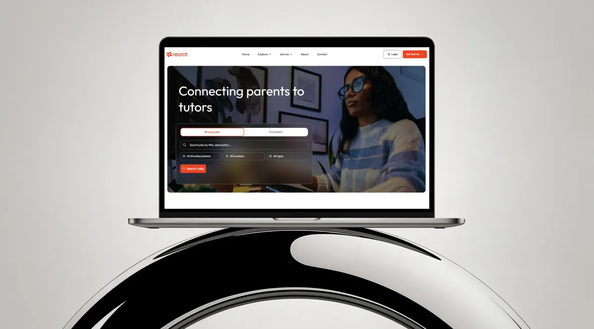
Icy Knock ki branding ka focus fun, freshness aur youth-centric energy ko highlight karna tha. Maqsad yeh tha ke ek aisi visual identity create ki jaye jo ice cream ke joy, chill factor aur vibrant flavors ko instantly communicate kare aur brand ko shelf par standout banaye.

Bright colors, playful typography aur engaging visuals ke zariye hum ne Icy Knock ko ek bold aur memorable ice cream brand ke taur par position kiya, jo har age group ko attract karta hai aur har bite ke sath ek refreshing experience deta hai.

02Chapter 02

Icy Knock’s Branding Vision

The branding for Icy Knock focused on highlighting fun, freshness, and a youth-centric energy. The goal was to create a visual identity that instantly communicates the joy of ice cream, the chill factor, and vibrant flavors, while making the brand stand out on the shelf.

Through bright colors, playful typography, and engaging visuals, we positioned Icy Knock as a bold and memorable ice cream brand that appeals to all age groups and delivers a refreshing experience with every bite.

03Chapter 03

Defining the Essence of Icy Knock

The vision behind Icy Knock’s branding was to capture the excitement, freshness, and joy associated with ice cream. Our aim was to build a visually striking identity that instantly attracts attention and communicates the brand’s fun and flavorful personality.

Each design choice was carefully made to enhance the brand’s playful character while maintaining clarity and consistency. The result is a bold and engaging brand presence that not only stands out on the shelf but also leaves a lasting impression on consumers.

Next project · App developmentRecrot

Tell us what you are building. We bring the strategy, design and technology to make it real.